

FREE DOWNLOAD: Business Analyst Documentation Toolkit
Get instant access to real-world BRD, FRD, and project story templates used by senior BAs.
Download Free Templates PDFIn Agile software development—specifically within the Scrum framework—a Sprint Burndown Chart is a critical visual tracking tool. It displays the amount of remaining work in a sprint on a daily basis, allowing Scrum teams, Product Owners, and Business Analysts to monitor progress, forecast sprint completion, and identify scope creep early.
What Is a Sprint Burndown Chart?
A Sprint Burndown Chart is a graphic representation of work remaining versus time. As the team completes user stories and tasks throughout the sprint lifecycle, the chart “burns down” toward zero by the end of the sprint duration.
Vertical Axis (Y-Axis): Represents the total remaining work, measured in Story Points, Ideal Hours, or Task Counts.
Horizontal Axis (X-Axis): Represents the time elapsed in the sprint, typically measured in Days.
Core Components of a Sprint Burndown Chart
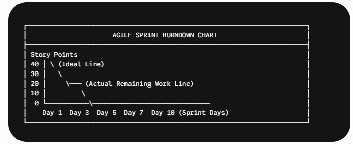
Ideal Work Remaining Line (Baseline): A straight diagonal line drawn from the total committed story points at Day 1 down to zero on the final day of the sprint. It represents perfect, linear progress.
Actual Work Remaining Line: A daily plotted line showing the real-time sum of uncompleted work remaining in the sprint backlog.
Sprint Commitment (Baseline Total): The initial sum of effort estimated for all user stories pulled into the sprint backlog during Sprint Planning.
How to Read a Sprint Burndown Chart
Analyzing the trajectory of the Actual Line against the Ideal Line provides actionable insights into team performance:
1. Actual Line Above the Ideal Line
Meaning: The team is running behind schedule. Work is not being completed as quickly as originally estimated.
Common Root Causes: Underestimated task complexity, technical blockers, unexpected dependencies, or scope creep (adding new user stories mid-sprint).
2. Actual Line Below the Ideal Line
Meaning: The team is ahead of schedule. Work is being finished faster than planned.
Common Root Causes: Overestimated story points during Sprint Planning, simplified solution implementation, or tasks being closed without full verification.
3. Flat Line (Horizontal Plateau)
Meaning: No remaining work was burned down over several consecutive days.
Common Root Causes: Mid-sprint blockers, complex tasks waiting for testing/QA sign-off, or team members not updating task statuses in Jira/Azure DevOps.
Real-World Scenario: Agile Sprint Execution in FinTech
Sprint Goal: Implement Multi-Factor Authentication (MFA) for an Online Banking App.
Sprint Duration: 10 Days (2 Weeks) | Committed Work: 40 Story Points
Sprint Progress Log:
Day 1–3: Team burns down 8 points (Actual: 32 points remaining vs Ideal: 28 points). Progress is steady.
Day 4: A Security Officer adds an unplanned compliance user story (+5 points) without removing existing work. The Actual line spikes upward to 37 points.
BA & Scrum Master Intervention: The Business Analyst identifies the scope creep on the burndown chart during the Daily Standup. The team negotiates with the Product Owner to swap out an equivalent 5-point non-critical UI refinement story.
Day 10: The team resolves final QA bugs and successfully burns down the remaining points to 0 on the final day.
A Sprint Burndown Chart is an essential Agile visual management tool that displays the amount of work remaining in a sprint backlog on a daily basis.
By comparing the Actual Work Remaining Line against the Ideal Progress Line, Business Analysts, Product Owners, and Scrum Masters can identify sprint bottlenecks, manage scope creep, and forecast team velocity.
📄 Business Analysis Documentation Hub
Explore where Sprint Burndown Charts fit into the complete software delivery lifecycle:
| Knowledge Area | Deep-Dive Article | Why It Matters for a Business Analyst |
|---|---|---|
| Agile & Delivery Metrics | Understanding Sprint Burndown Chart | Master tracking sprint progress, team velocity, and backlog execution in Scrum frameworks. |
| Agile Frameworks | Significance of Burndown Chart in Scrum | Learn why burndown charts are essential for sprint tracking, daily standups, and Scrum team alignment. |
| Practical Examples | Burndown Chart Real-World Examples | Explore step-by-step visual examples and scenarios of ideal vs actual progress trajectories. |
| Agile Tooling | How to Create Burndown Chart in Jira | Practical tutorial on configuring estimation fields, sprint boards, and burndown reports in Jira. |
| Step-by-Step Guides | Burndown Chart: How to Create Step-by-Step | Comprehensive guide on calculating story points, setting up baselines, and plotting burndown charts manually or automatically. |
| Business Strategy & Analytics | Cost-Benefit Analysis Techniques | Evaluate financial ROI, payback periods, and resource allocation before initiating development sprints. |
| Requirements Engineering | SRS Full Form in Software Engineering | Learn how technical requirements and sprint backlogs are derived from Software Requirements Specifications. |
| Software Lifecycles | Waterfall Methodology in Software Development | Compare linear milestone tracking in traditional SDLC against iterative burndown metrics in Agile. |
Frequently Asked Questions (FAQs)
The primary purpose is to provide immediate, visual visibility into whether a Scrum team is on track to complete its committed sprint goal by the end of the iteration.
In modern Agile tools (like Jira or Azure DevOps), the chart updates automatically as developers and testers move user stories across board workflow columns (e.g., from In Progress to Done).
A Burndown Chart tracks remaining work trending down to zero, whereas a Burnup Chart tracks completed work trending upward toward a target line, making scope changes explicitly visible over time.
🎁 Become a Better Business Analyst
Join 1,200+ Business Analysts learning every week.
Get instant access to:
📘 FREE Business Analyst Templates
🎯 Interview Preparation Guides
🚀 Agile & Scrum Tutorials
🤖 AI for Business Analysts
📈 Career Growth Tips
100% Free • No Spam • Unsubscribe Anytime

Thank You.
Thank You.
Thank You.
Thank You.
Thank You
Thank You
Thank You